Robert Mapplethorpe (Portfolio) was an iconic photographer of the 20th century-famous for his black and white provocative portraits of men. Robert was born and raised in Queens in a strict catholic family.
Mapplethorpe did not start out as a photographer. He studied drawing and graphic arts at Pratt in Brooklyn, and hobbied in mixed media collage. Robert was engaged in the avant garde scene of the city in the late 60s and early 70s; connecting with artists, musicians, and socialites living in the Chelsea Hotel. Mapplethorpe did much of his creating and artistic expression under the influence of psychedelic drugs such as LSD. The first camera he owned was a Polaroid and was mainly interested in photographing friends to integrate into his collages. The Light Gallery in NYC held a show of his Polaroids in 1973.
Robert acquired a Hasselblad camera and with the change in format came a change in subject as well. He began his professional career by taking Patti Smith's portrait for her album cover, and also party pictures for Interview Magazine. From here his career began to expand.
While exploring his sexuality, Mapplethorpe was photographing the New York City S&M scene. While his photographs where aesthetically pleasing to the eye, they also shocked, excited and disturbed audiences. Yet, perfection that Mapplethorpe strives for in his photographs of the male form make his work more serious.
As his career and scope expanded, he was showing at multiple galleries in New York and was even envited to show at Documenta 6 in Kassel Germany which is a famous festival of contemporary art. Eventually, the Robert Miller gallery became his exclusive dealer.
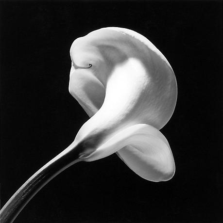
As times changed in the city and America welcomed the Reagan administration, Mapplethorpe's style was changing rapidly to more stylized, aesthetically pleasing images of the nude form and flowers. Mapplethorpe photographed flowers in a sensual manner just as Georgia O'keefe depicts them in her work.
When I visited the Accademia in Florence last year, I was surprised to see in the sculpture room a lone photograph of a nude male by Robert Mapplethorpe-it complimented and contrasted the classical sculpture so well. Seeing that piece really cemented the idea of a photographer's artistic influence on the past and present.
In 1989, Robert Mapplethorpe died from health complications due to AIDS. His provocative work can be seen in many art museums such as the Getty, MoMA, the Tate, and Guggenheim.
Here is a video of Patti Smith talking about her relationship with Robert Mapplethorpe. Her book Just Kids includes a lot about their relationship, and exposes Robert as a kind and gentle person.
References
The Robert Mapplethorpe Foundation
http://www.mapplethorpe.org/
Getty Museum
http://www.getty.edu/art/gettyguide/artMakerDetails?maker=2969
The Tate
http://www.tate.org.uk/download/file/fid/12777
The Frick Photoarchive (take the tour here)
is comprised of over one million photographic reproductions of western
art. They are on their way to digitizing their whole collection through
grant funded projects.
The homepage from the Frick Digital
Image Archive is very accessible to guests. There is a main keyword
search that auto searches all entry fields. I think that this search
function is superior rather than searching exclusively. You can
also browse the collection. Only some of the collections have finding
aids attached to the collection description, I am unsure of why this is.
One thing I really liked about the Frick's photoarchive is that they have a blog. I think that it is important to document new findings and progress that happens within their institution to show that they are moving forward and committed to improving their information and access.
The Frick's photoarchive is unique because of their
commitment to documenting the history of art through capturing
conservation measures taken and documenting multiple versions of a
single work. Not all of these captures are available digitally though.
The collections I explored the most was the endangered library negatives in private collections. The display of the collection is customizable to the viewer which is handy. Two of the views are simplistic and image based. The "long view" is most user friendly because the images are not just labled by file names, but almost the whole file record is displayed next to the image. It is not obvious how to navigate to the next pages of the collection and I was unsure of how to do this at first.
Collection description:
This collection description is thoughtful and informative. It includes the details about the content in the collection, the history and geographic locations of the works photographed, and the Frick's future plans for making this content more available to users.
Image record:
I think that the image records in this collection are very concise. More information is made available to users by the library and is accessible by a link in the image file record in FRESCO. (research and documentation info)This information is much more complete and detailed than the image file record and includes useful information about the provenance, Library of Congress subject headings, etc... I think that if these two records were combined it would make accessing this information easier; just taking out that one step and having all the information together would be better.
The digital images are available for download (jpegs) on the website and also on ArtStor!
One discrepancy I noticed between multiple image records was that there was a "school" field
and/or a "genre" field displayed. I think that this could be useful for searching if there were a way to search exclusively, but in this case there is not. I think that they should eliminate the school field and keep genre. As for the material field, the meta is referencing the material of the
original object photographed, and not the type of film used etc. I think
that this is fine to do because it is not the photographs and negatives
that are being studied, rather the works of art.
Other names: photo-relief process, photoglyptie (France), and woodburydruck (Germany).
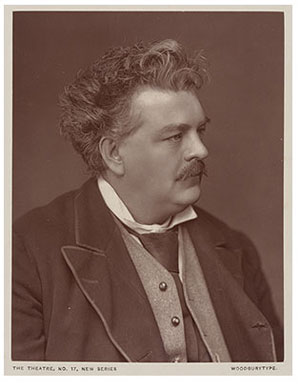
The woodburytype is a very unique process because it combines photography and the printing press. The final result is not a photograph at all, but a print with slight reliefs. This innovative new process made photo-like images cheaper then ever before and easy to produce.
Inventor:
The woodbury process was invented by a man named Walter Bently Woodbury (1834-1885) in 1864. He was born in Manchester, England and spent much of his life abroad. As a young boy he was fascinated with photography.
Woodbury c. 1870
"my greatest pride, at the age of twelve, was to take by boyish companions to the garret, at the top of the house, where I had, by means of an old magnifying mirror, from which I removed the mercury backing, and a sheet of looking-glass, been able to throw a two-food image onto a table beneath... The idea that such a picture could be fixed was too wild to be even dreamt of in my young philosophy" - Woodbury, from his unpublished memoir.
As a young man, Woodbury began to train as a civil engineer but was motivated by the Austrailian gold rush and moved to Melbourne in 1852. Disappointed by gold prospects, Woodbury managed multiple manual labor positions. He eventually saved up money to purchase a camera and started to study the art of the collodion process.Fed up with manual labor, he wrote his mother...
"the only work to be done in Melbourne is either stone breaking or shepherding neither of which I feel inclined to take so I am going to turn photographic artist."
Woodbury began a few business endeavors with fellow photographers at various studios in the Melbourne area, and soon met photographer James Page. Page and Woodbury decided to travel to Asia to look for better business opportunities. On the Indonesian island of Java, they found an abundance of wealthy of Europeans. Here, Woodbury shot panoramas, stereographs, portraits and experimented with different photographic processes and techniques. In 1863, because of ill health, Woodbury returned to England.
Invention:
Woodbury was searching for a print that would be more permanent than albumen prints and had a better half tone than carbon prints. Barret Oliver's book on Woodbury gives a great account on Woodbury's invention process: "...From the time of Woodbury's return to England until 1864, he worked sporadically on the developments that would later become the Woodbury type. His experiments started with two observations. On his trip to England in 1859, he saw a window transparency hanging in a friends home and was fascinated by the different opacities it possessed. Then, in Java, while making prints by the carbon process, Woodbury noticed the distinct relief in these pictures. He put the two ideas together thinking a carbon print used as a mechanical plate should be able to produce different opacities like the window transparency...."
On March 17, 1865 Walter Woodbury announced his new process of photo-mechanical printing.
Process:
Three main steps to this process: 1) A gelatin relief is made from a negative. 2) The relief is then pressed into a sheet of lead forming a reverse matrix. 3) A print is made by pressing the lead plate mold onto paper with a coat of gelatin on it.
This diagram is from Oliver's book.
1) The negative is printed onto a sheet of bichomated gelatin (a mixture of potassium bichromate and gelatin) and exposed to the sun.Collodion negatives are preferred because they have a high contrast. The gelatin hardens when exposed to light and the unhardened gelatin is washed away. The gelatin relief is in reciprocal proportion to the density of light on the negative.
2) The gelatin relief is then imposed onto a sheet of lead by a press. The relief is now reflected in the lead.
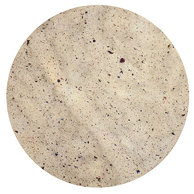
Pigmented gelatin. 500x
3) Pigmented gelatin is applied to the lead relief and a smooth, coated piece of paper is placed on top of the gelatin. The pigmented gelatin is unique to the woodburytype process and used in no other photomechanical method. It is not opaque, but semi transparent which allows the white paper base to show through to give the image a better half-tone. The gelatin sandwich is then placed into a special woodburytype press and put under slight pressure. Early models of woodburytype presses were similar in appearance to a printing press. After five minutes, the gelatin sets and is removed from the press. The paper with the gelatin image on it is submerged in a chemical bath to make the image permanent.
The result is a gelatin relief image--the tonal range is directly
related to the thickness of the pigmented gelatin--the thicker the
gelatin, the darker the tone. It is important to note that the mold is made by the photographic
process but the print is made by a press and is not actually a
photograph. Most prints come out brown to purplish
brown because of the gelatin color. The final prints are most often
framed or mounted to cover up the excess gelatin remaining on the
outside of the printed area.
These images were commonly used for illustrations in books, in publications, cabinet cards, and portraits from 1866 to 1900. Woodburytypes were not frequently used for landscapes because the
gelatin had a hard time setting in a relief where the corresponding
negative had large patches of white, such as sky.Woodburytypes are always found mounted on cardstock for cabinet cards or tipped-in to publications or books.
A Mountain-Dew Girl:Killarney
The first published woodburytype print appeared in the January 1866
issue of the Photographic News, A Mountain-Dew Girl:Killarney. The photo
was taken by H.P. Robinson and a copy of the journal is now at the
Clark art institute in Williamstown, MA. Woodburytype identification:
Only printed between 1866 and 1925.
Usually are printed with a description identifying them as such.
Always mounted, never loose prints and never printed directly onto a publication.
Usually have a purpulish brown tint.
The contrast of Woodbury types is softer than other processes, such as carbon prints.
High-gloss surface.
Resources:
Oliver, Barret. A History of the Woodburytype: The First
Successful Photomechanical Printing Process and Walter Bentley Woodbury.
Nevada City, Calif: Carl Mautz Pub, 2007. Print.
Ritzenthaler, Mary L, Diane Vogt-O'Connor, and Mary L. Ritzenthaler. Photographs: Archival Care and Management. Chicago: Society of American Archivists, 2006. Print. http://www.graphicsatlas.org/identification/?process_id=38 http://www.luminous-lint.com/app/photographer/Walter_Bentley__Woodbury/ABCDEF/
P:ACM is straight forward and detailed in stating what skills an appraiser should have, what to look for in a potential gift or purchase, how to assess candidates for potential acquisition, and a lot more. I think the most important thing to consider when appraising
photographs is finding the best materials to meet your institution’s needs (and in the same light finding the best home for the materials offered.) Developing and working with a collection policy is helpful and efficient, I also thought that the photographic accession appraisal form was a good tool for appraisers to use for organizational purposes.
After evaluating the potential acquisition (in terms of functional value inside the institution, informational value and original context, degree of documentation, preservation or legal risks, relevance to the current collection, and ) the appraiser needs to seriously consider if their institution is the best home for the proposed works.
Will the institution be able to provide monetary support in terms of preservation?
Can they provide appropriate access to the photograph for researchers?
Is there another place in which this work could thrive more so?
A photograph of value for a fashion archive is not of the same
value to a scientific institution dedicated to the study of plants. That is why
archival agencies should refer materials to appropriate institutions. By providing the best context for a work, the value of it is immediately increased. In terms of art work, I think the best placement for a work would be in the context of its cultural heritage. I am not sure if I believe that to be true with photographs, because they are not only to be considered works of art but scientific documentations as well.
Creator: Weegee, North American; American, Born: Poland, Zloczew, 1899, Died: US, NY, New York, 1968 Title: Tenement Penthouse Date: ca. 1940 Material: gelatin silver print Source: George Eastman House. Rochester, New York.
I chose this photograph because I really like the composition; how it looks staged even though it is a candid shot. I was exploring some work of Weegee's because I was interested in the pictures he would take on the NYC subway by hiding his camera in his jacket. A bit about the background... these children are sleeping on a fire escape outside a tenement building because of the intense heat of summertime in the city.